Testing the waters
A dear friend of mine purchased a floating home just about a year ago. When she purchased it the colors were a nice conservative brown with white trim. Nothing controversial but also nothing particularly interesting either.
For a lot of people this would be fine. However this person is an artist. She paints wonderful, vibrantly colorful abstracts and subtly nuanced watercolor figures. You can see her work at emilyweil-art.com.
If you went to look at her work, you’ll understand why the brown and white had to go.
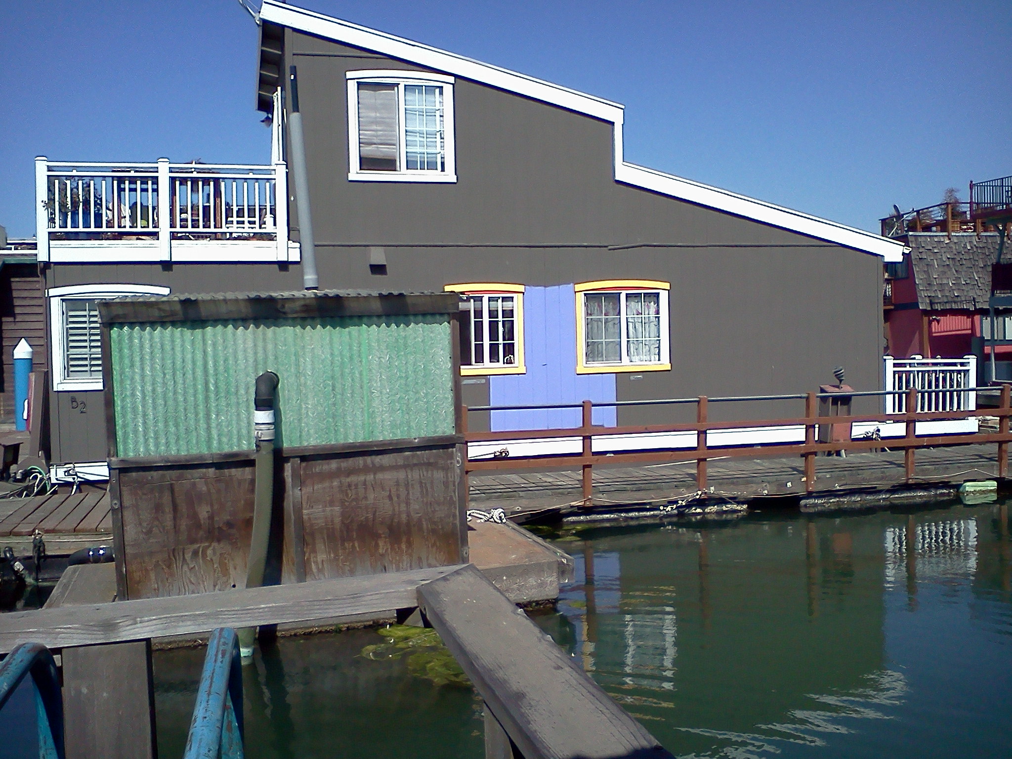
Encouraged by conversations with her neighbors, she started working on a palette. You can see the first color test here. (Taking a picture very much like this is how I dropped my cell phone into the bay. This one was taken from shore where, if I dropped it again, all that would happen is it would get dirty.)

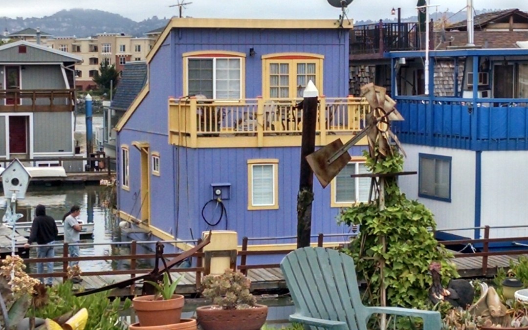
The Lily Pad in all her glory
After a little adjustment to the background color (it was too purple) her home has been transformed from drab to fab (did I really type that?)What doesn’t show in these pictures is the vermilion accent colors over the windows and on the railing caps. It’s a real show stopper, and the first thing you see when you pull into the parking lot.
She’s hoping it will inspire the neighbors to step up and join her in making this the most colorful house boat marina on either coast.
And then there’s the front door. I’ll have to get a picture of that next time I visit. It’s green. A green specifically selected to go with the house sign I made for her. I’m honored.

House sign
And inspired. Inspired to live more colorfully. Inspired to be willing to stand out. How about you? What can you do to add color to your life, and I don’t mean just paint.
I am soooo drawn to start coloring again, so will find something detailed and beautiful on paper to fill in with pens, crayons, ink, or perhaps all of the above!